In my last post, I shared the beginning of illustrating “Hagga’s Last Vattiegirl”. In this post, I’ll take you from rough sketches to the coloured final illustrations.
Rough Sketches
Remember those chicken scratch thumbnails I made? After the client selected the best one per scene, my next task was to make them more discernible. I know that ‘discernible rough sketches’ sounds like an oxymoron, but please bear with me. You’ll see what I mean in a bit. Unlike with the thumbnails, I decided to go the digital route for the rough sketches. Why? Digital sketches made it easier for me to scale and compose the scene’s elements. It gave me more precision, more than if I’d tried with pencil and paper.
And, believe you me, I went through many trials and plenty of errors before I finally cozied up to Photoshop.
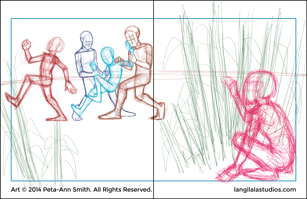
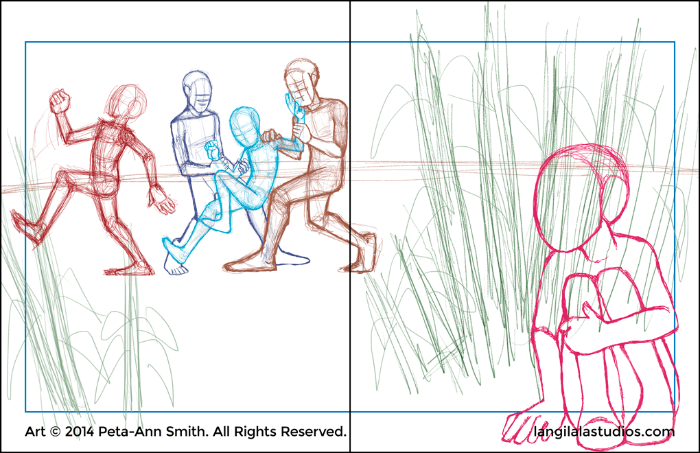
Digital sketches made it much easier for me to scale each character. It also helped me to create a greater sense of depth in such a crowded scene.
Another digital benefit was that I could develop various poses for particular characters. This allowed me to change the composition without impacting subjects or wasting paper.
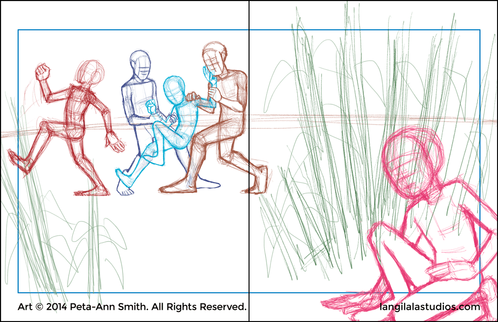
Option A
Option B
Option C
In the end, chose Option B for Daphne. For one thing, it put her up front for the viewer while hiding her from the boys. Also, that pose was more comfortable than crouching on one knee in the dirt. Trust me, I’m speaking from experience.
Drawings
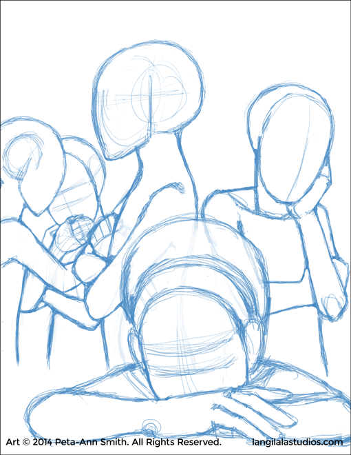
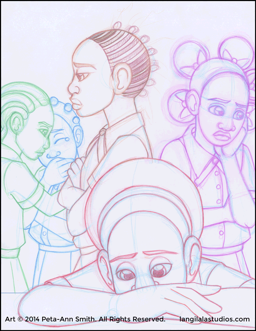
Photoshop is great for manipulating ideas, but I prefer doing the final drawings on paper. I doubt that will ever change, even with Photoshop’s Undo feature. First I printed the digital roughs on to scrap paper and then I traced them all onto fresh Bond paper using a light box. A quick note: I only mention Bond paper because I have a good stack left over from college. Otherwise, I say use whatever good-to-great quality paper you have available.
After tracing the roughs, I also drew in the details using Col-Erase pencils. Again, this is a personal preference. I used to use regular drawing pencils for my work up to when I encountered this type and made a switch. I like Col-Erase pencils because I can distinguish characters from other scene elements. What do I mean by that? I can, say, make the characters one colour and the remaining items another. I can even use several different colours throughout for greater distinction. It’s depends on the approach I choose while drawing, as well as how many different pencil colours I have on hand. I’m down to Blue at the time I write this, but I digress.
I gave the girls their faces and other features. Now we can tell who’s who and that they’re glum – and we haven’t started colouring yet.
Final Illustrations
Thirty-two (yes, people, *thirty-two*) drawings later, I was ready to colour. After drawing so many pieces in a short space of time, I wasn’t up to either traditional or digital inking. At all. For real – there was no gas in the tank for that. My solution? Colour them all without any prior outlines. This was something I had never done before, and I was attempting it with my first major project. Let no one say that I lack a masochist streak. Oh, remember when I said ‘so many pieces in a *short space of time*’? During the time it took me to shake off the funk and become productive, the client’s patience was running on fumes. She might have had the patience of Job but even Job started cussing after a while. That added more fire under my tail. I had *finally* hit my professional illustrator groove and began enjoying the project. I wasn’t about to lose it all at that stage.
The colouring process went like this:
First, I blocked out the Base Colours using the Basic Brush tool. I put each element on its own layer (e.g. skin colour on one layer, socks on another). Back then, I wasn’t skilled enough with the Lasso tool to isolate certain areas and fill it with the Paint Bucket. That’s a technique that would have made my life easier, but you live and you learn.
With the base colours established, I moved on to the darker shadow tones and then the highlights.
I used minor lines to distinguish certain areas – each on their own respective layer, of course.
Colours in place, I finished the illustration off with a paper texture layer. I wanted to give it an aged and interesting aesthetic, like an old story book.
After rinsing and repeating thirty-one times later, the end had come. I had fulfilled my role in “Hagga’s Last Vattiegirl”s development.
And within the final deadline to boot.
From Drawing to Coloured with all the steps in between.
Conclusion
And there it is, gentle people – my process of illustrating “Hagga’s Last Vattiegirl”. Along with my approach to work, I hope you gained insight into my mental struggles along the way. Those overcast days made working a tremendous challenge, especially in the beginning. But (in hindsight) I’ve emerged stronger, more skilled, and more knowledgeable as a result. I’m more in touch with my physical and mental weaknesses and I’m better able to work around them. I’m better able to structure my working hours and respect both my health and the client’s time table. As a bonus, I’ve learned a lot about book dimensions and printing profiles. More than I had in a classroom setting. If I came out of this experience not being a more professional and decisive illustrator, something would be wrong.
Now I turn the keyboard over to you. What do you think of my process and my work? Leave your thoughts in a comment below, and join my mailing list to get blog updates (and more – later!) fresh in your inbox.
Peta-Ann is a chocoholic nut who loves to draw, and loves making a living by loving to draw. She's also a novice animator and is scrubbing the rust off of being a writer.